01 · Sketch
Three ways in
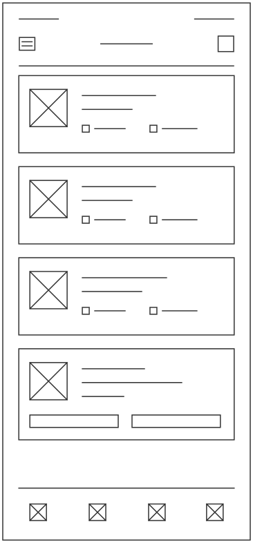
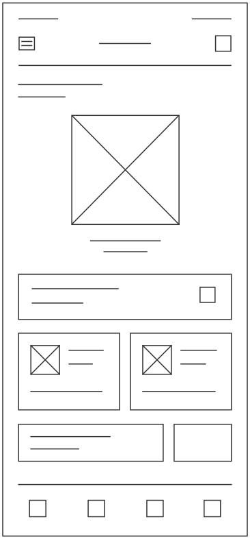
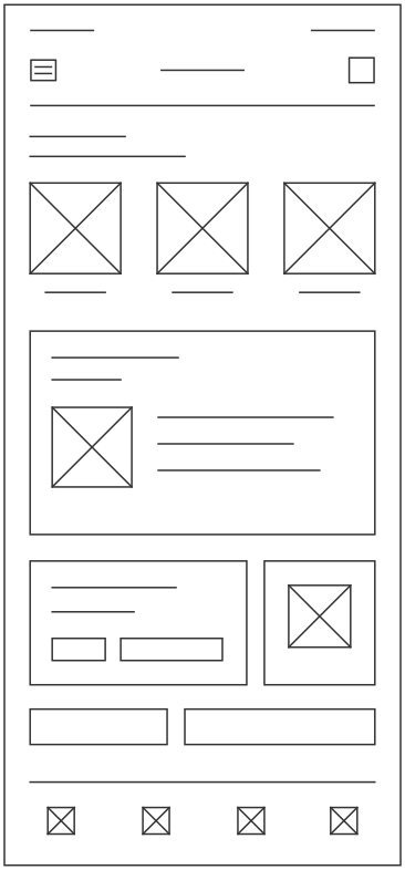
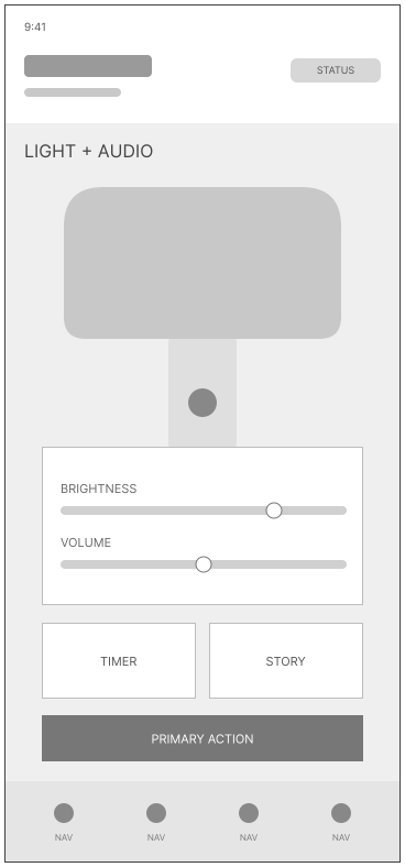
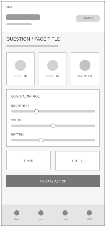
We sketched three directions for the parent app: a list of control cards (A), a layout built around the nightlight itself (B), and a scene picker (C).
Work / Lumino
A companion that guides young children to sleep on their own.
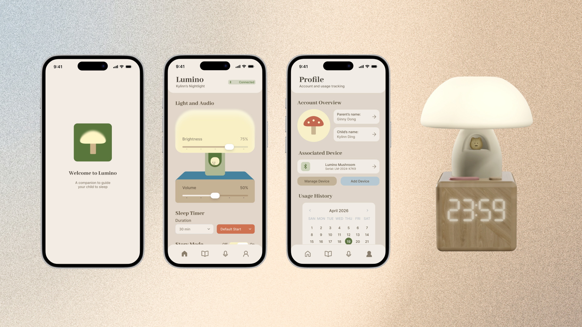
Lumino is a smart mushroom-shaped nightlight and companion app that supports young children through the transition to sleeping on their own. The nightlight offers soothing light to help a child self-settle, with a built-in speaker and mic that play parent-selected audio and enable a two-way intercom. Through the app, parents control the light and intercom and select or upload stories and audio.
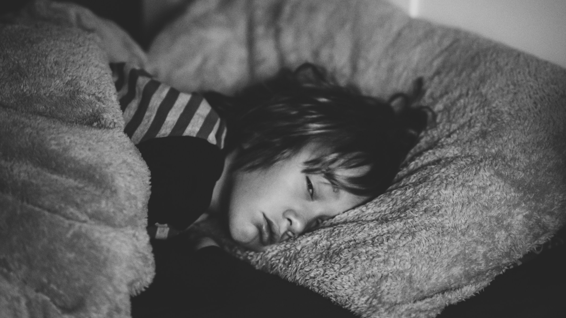
A child moves out of co-sleeping and is about to sleep alone. At first they wake at night, call out, or need a parent nearby to settle back down. For the child, the dark room feels unsafe without a parent close by. For the parent, the repeated check-ins and drifting bedtimes mean lost sleep that follows them into the next day. This in-between stretch, no longer co-sleeping but not yet independent, is where it feels hardest for both.

of toddlers and preschoolers are affected by bedtime problems and night wakings.
of 4-6-year-old children experience nighttime fears.
is among the top sleep concerns parents raise with pediatricians.
We surveyed eight parents with a young child under five. Their answers backed up the secondary research: bedtime is relatively stressful for them, and they are open to an outside device helping with it.
Children are afraid of the dark and of being alone — what they need most is their parent's presence. But parents reported re-entering the room one to two times a night, describing bedtime as moderately stressful. A replacement for parent presence is needed.
Targeting 5-year-olds, every interaction had to be tactile and single step. Anything harder to operate in the dark risks becoming its own source of frustration, undermining the sense of security the device is meant to give.
How might we help young children feel safe sleeping on their own, while easing the nightly stress on their parents?
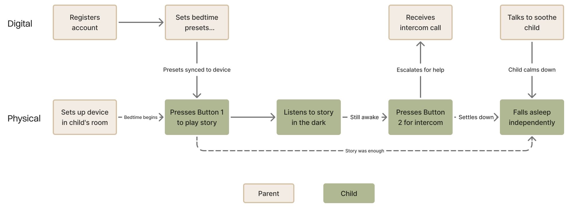
This chart shows how the child's and parent's actions stay two separate flows on either side of the product, only meeting when a story alone isn't enough and the child escalates to the intercom, before the flow rejoins at the child falling asleep.
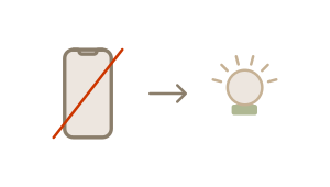
Our users are 4 to 6, so the child's side stays fully tangible: a light to pat and two buttons to press, with no screen at bedtime.
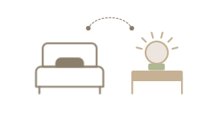
It sits within arm's reach of the bed, so a child can work it alone in the dark. Parents reach the same controls through the app from wherever they are.
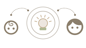
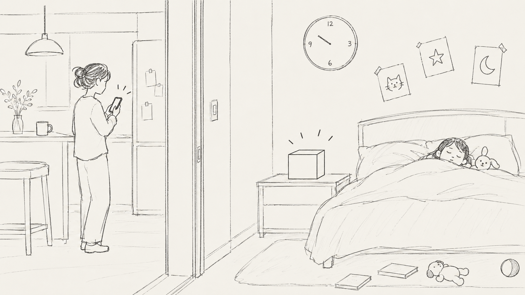
The light and a parent's own recorded voice keep the child company. The parent settles them without walking back in, so both sides get through the night.
With the direction set, we sketched broadly to explore form, proportion, and how a child might physically interact with the device before narrowing down.
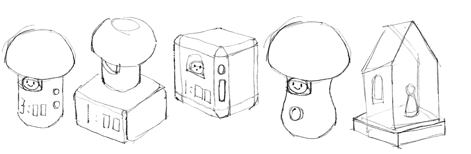
From this range of early ideas, two directions emerged, each answering the brief differently: a simple mushroom nightlight, and a more playful glass house.
Mushroom Nightlight
A familiar form the child can bond with: a soft-glowing top and two buttons, one for a story and one to reach a parent. Safe and simple enough for a child to use alone.
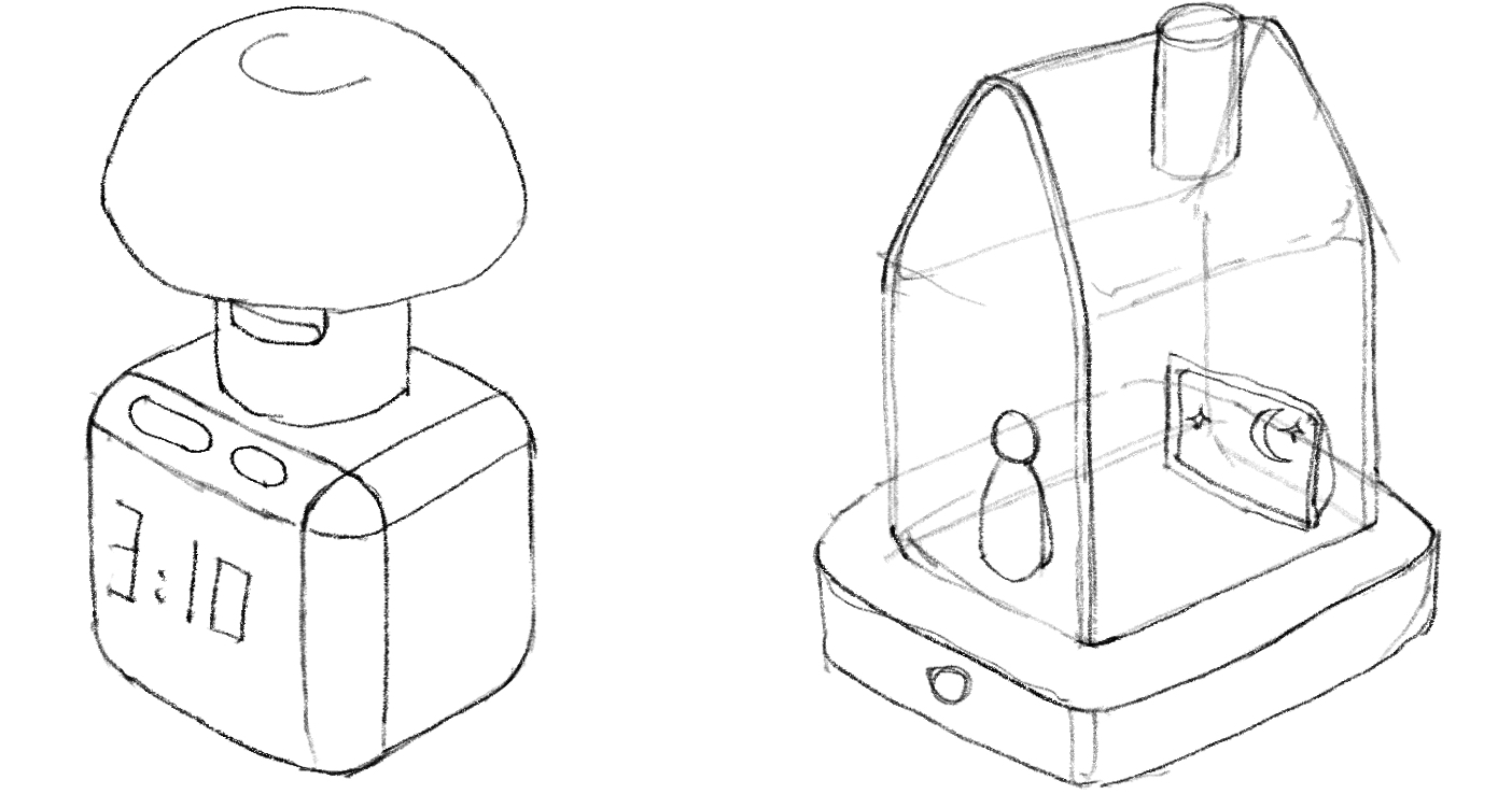
Glass House
A playful, narrative concept: placing a magnetic figurine inside the translucent house makes it glow, while a small screen inside plays a gentle night scene to follow.
My teammate and I split on which direction to build. They were drawn to the glass house's storytelling, while I worried it asked too much of our users. Rather than argue preference, we evaluated both against who we were designing for.
Weighed against our users, the glass house raised three concerns: the interaction was too complex for a 3–6 year old alone in the dark, glass raised real safety worries at bedtime, and the animated scene risked engaging the child instead of settling them to sleep.
Grounding the decision in the user, not our preferences, gave us a shared way to converge. We committed to the mushroom and brought it into 3D.
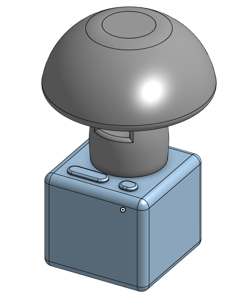
Intercom Button
Keep pressing to activate intercom feature: hold to talk. The button is sized with a length of 1.8 inch for toddlers' small hands.
Play Button
Press to start playing the preset story/audio playlist. Size is differentiated from the intercom button so that it can be distinguished by touch in the dark.
Silicone Top
The tap-to-activate silicone top is designed to suit toddlers' limited fine motor control. An open-palm pat is instinctive, and its soft and smooth texture prevents potential harm in darkness.
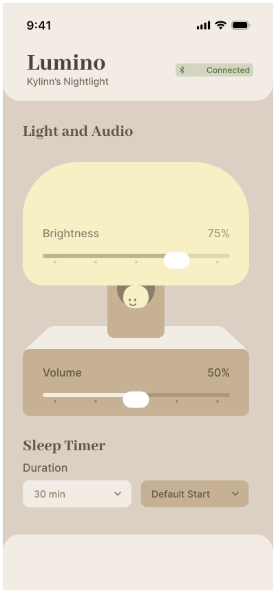
After exploring several interface directions, we chose to place graphic representations of the app’s content at the center of each screen. This created a clearer visual focus, made the controls easier to scan, and gave Lumino a friendlier, more cohesive character.
We sketched three directions for the parent app: a list of control cards (A), a layout built around the nightlight itself (B), and a scene picker (C).
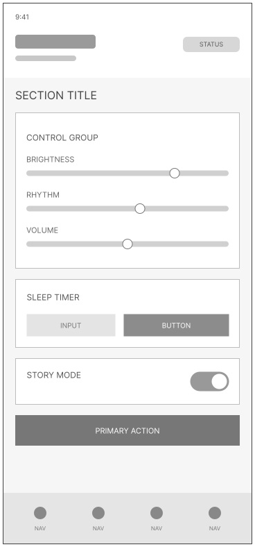
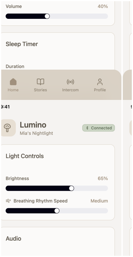
Each sketch became a mid-fi wireframe holding the same controls, brightness, rhythm, volume, timer and story, so we could compare how each one organised them.
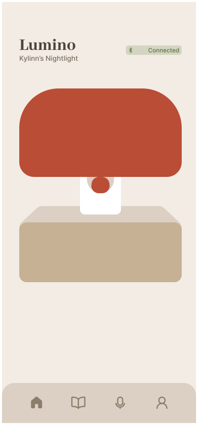
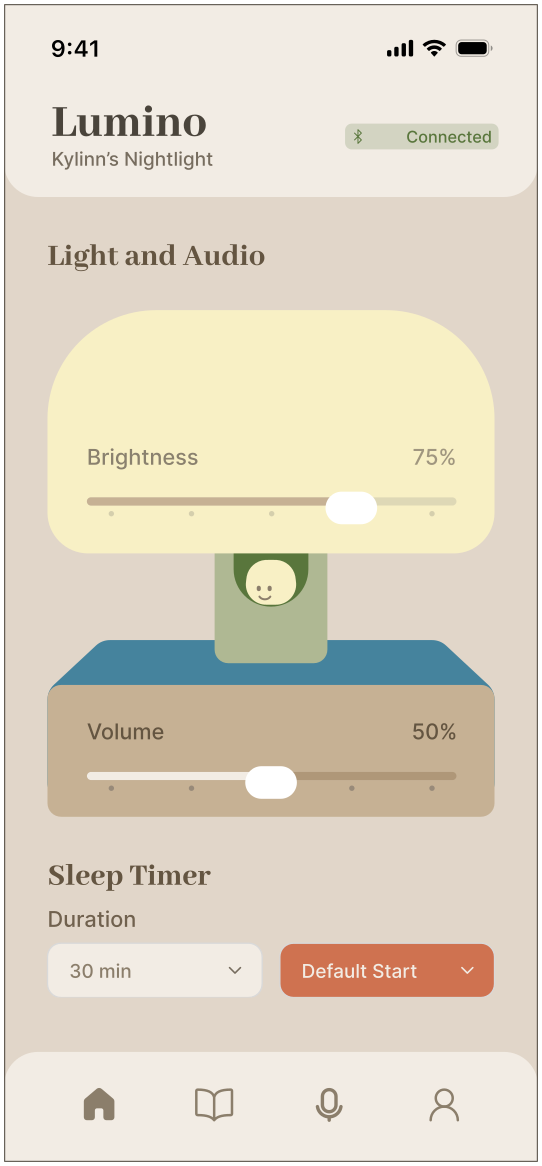
The scene picker added a step parents didn't need at bedtime, so we set it aside. The control list went to hi-fi as it was, and the device layout got two takes: the nightlight alone, and with controls built into it.
We kept the controls on the device: brightness lives in the lamp, volume in its base. With the nightlight at the centre, each screen has a clear focus and Lumino a friendlier character.
We ran a moderated usability test with parents of a four-year-old, using four task scenarios and a SUS-style rating. Every task was completed, so the structure held.
Parents liked the split: the child stays off screens while they stay in control from another room, as they already do.
Parents found the mushroom warm and approachable, and were happy to keep it by the bed. It read as friendly, not tech.
Parents set up stories, adjusted the light, and reached their child without confusion, even at the end of a long day.
Parents also pointed out a few small gaps. Based on their suggestions, we refined these UI and function details.
The main screen didn't signal that more content was available, so it went unseen until prompted.
There was no way to know what a story contained before it reached the child. Parents need to preview the story contents first before adding them to a playlist.
Given the possibility that users may purchase multiple devices or change devices, there should be a section in settings to delete or connect devices.
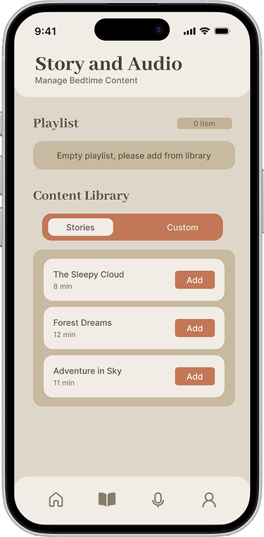
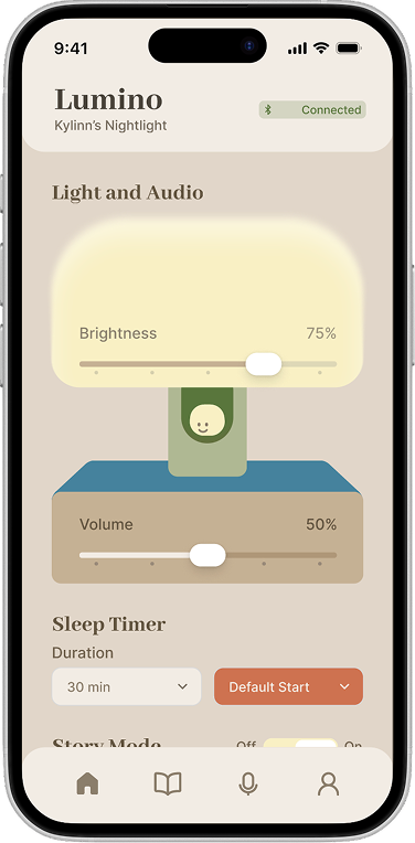
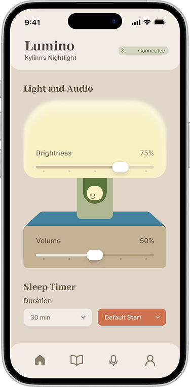
Page 1: Added a peek of the next section and a soft gradient at the bottom edge, so the main screen signals there's more below. This turns the fold from a hard stop into an invitation to keep exploring.
Page 2: Moved the play button to where participants instinctively reached. A clearer preview page is created after clicking the button so parents can check content in advance and avoid risk.
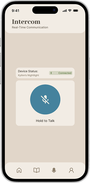
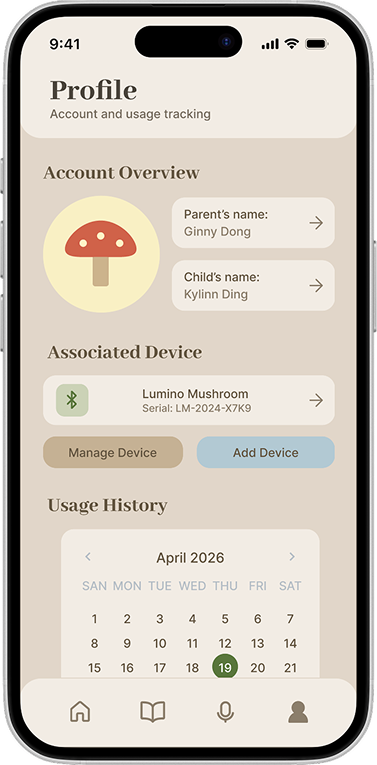
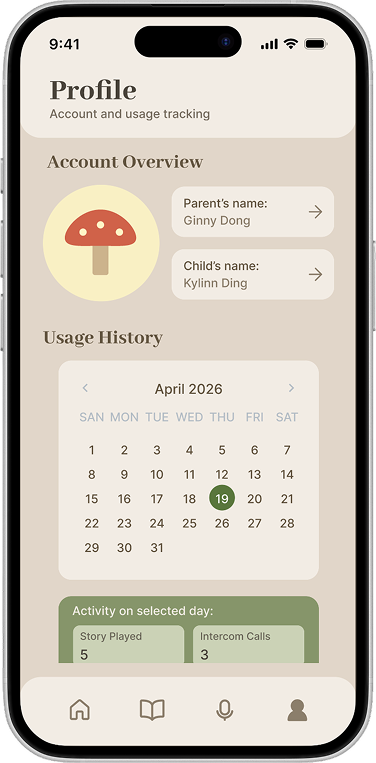
To better manage devices and show connection status, I moved the connection status into Settings and expanded it into a full device management section, so parents can see, connect, and manage multiple Luminos in one place. On the Intercom page, I added a speaker illustration with a real-time Bluetooth status icon, and the illustration shifts between two states to reflect live call status.
39 of 40 attempts completed across 5 participants and 8 tasks.
"Really great job on the thoughtful child-centered design. Strong needs analysis and thoughtful physical and anthropometric reasoning."
— Professor Intriligator
Next time I'd map how child and parent move between device and app before any screen, so the physical and digital split follows the flow.
The next step is testing within parents' actual evening routine rather than a neutral setting, since context does half the work here.
Device management opens the way to households with more than one child and more than one Lumino, which the app could grow to support.